

Mobile-First Layouts
Every template designed at mobile width first, so the small screen gets the clearest hierarchy rather than the leftovers.
View moreHome/Responsive Web Design
More than half your visitors arrive on a phone. Responsive design is not a finishing touch on a desktop layout — it is where the design should start.
Responsive design means one site, one codebase and one set of content, reflowing intelligently rather than a stripped-down mobile version hidden behind a redirect.
We design the smallest screen first and let the layout expand. That order forces clear priorities, and it is why our mobile experiences do not feel like an afterthought.
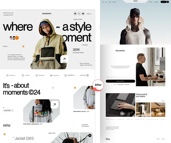
The details that decide whether a site feels native on a phone or merely survives on one.
Every template designed at mobile width first, so the small screen gets the clearest hierarchy rather than the leftovers.
View moreLayouts that adapt continuously between breakpoints instead of snapping awkwardly at three fixed widths.
View moreMenus, filters and carousels that work with a thumb, at the sizes fingers actually need to hit reliably.
View moreModern formats and per-device sizing so phones are never sent a desktop-sized hero image over mobile data.
View moreChecked on real iOS and Android devices as well as the desktop browsers your audience still uses.
View moreContrast, focus states, semantic structure and keyboard navigation reviewed before launch, not bolted on later.
View moreA layout that looks right on a phone but takes eight seconds to appear has not solved the problem. Weight and load order are design decisions too.
We set a performance budget alongside the visual direction, so heavy carousels and oversized fonts get questioned while they are still cheap to change.
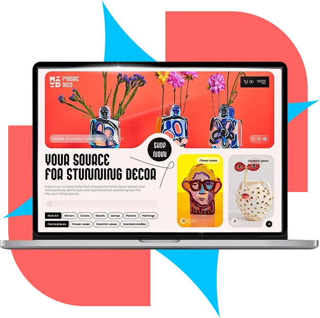
Search indexing is mobile-first, which means the mobile version of your page is the one being assessed for ranking.
We make sure the small-screen version carries the full content and structured data — not a trimmed version that quietly costs you visibility.
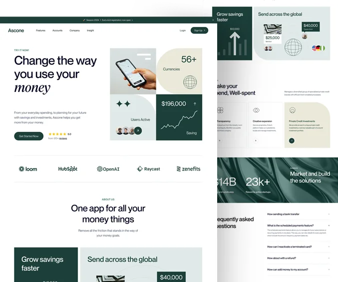
Sites built to hold together from a 360-pixel phone up to a widescreen desktop.

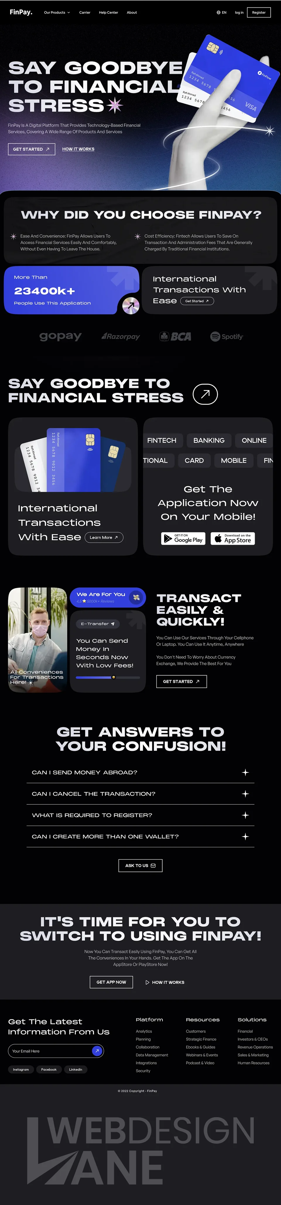
Kodex Designs believes in transparency every step of the way, keeping you in the loop with every executed plan.
We get to know your brand, your goals, and the audience you intend to reach through conversations and discovery calls.
We draft a tailored action plan with clear deliverables, timelines, KPIs, and the tools and platforms we will use.
Our team sets the plan in motion, and you are updated on progress at every stage of the build.
We make every necessary retouch before launch. Only when you are satisfied do we go live — then we stay on for ongoing improvements.
Yes. Every site we build is responsive. This page exists for clients who need an existing site fixed rather than a new one built.
Often, yes. We audit the existing templates first — sometimes retrofitting is the cheaper path, and sometimes a rebuild is.
Almost never. Separate mobile sites split your content and your SEO. One responsive site is simpler to run and ranks better.
Current and recent iPhones and Android handsets, tablets, and the major desktop browsers — on real hardware, not only emulators.
We will audit how your site behaves on real devices and tell you exactly what is costing you.


