

Custom Wordmarks
Your name drawn as a single designed unit, with spacing and letterforms tuned by eye.
View moreHome/Typographic Logo
A wordmark carries your name and nothing else, which means every letter has to work. Done well, it is the most durable form a logo can take.
Typing a name in a licensed typeface is not a wordmark. It is a starting point that anyone else can reproduce in seconds.
We draw and refine the letterforms — adjusting weight, spacing, joins and terminals — until the word reads as a designed object rather than set text.
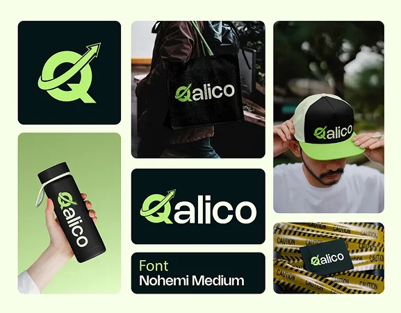
Different forms a name-led identity can take, depending on how it will be used.
Your name drawn as a single designed unit, with spacing and letterforms tuned by eye.
View moreInitial-based marks for long names, and the compact version every brand eventually needs.
View moreHand-built letterforms with genuine character, for brands that need warmth rather than neutrality.
View moreCorrecting spacing, weight and proportion in an existing mark without losing recognition.
View moreHorizontal, stacked, icon-only and tagline versions, so there is always a correct one to hand.
View moreThe supporting typefaces that sit beside the mark across web, print and interface.
View moreDefault kerning is a compromise designed to work across every possible word. Your name is one word, so it can be spaced precisely for itself.
That optical adjustment is what separates a wordmark that reads as designed from one that reads as typed, even when most viewers cannot say why.
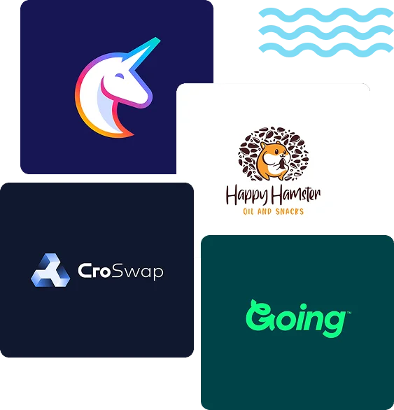
A wordmark lives in browser tabs, app icons and social avatars, where fine strokes disappear and tight counters fill in.
We test at real sizes throughout and supply a simplified small-size variant when the full mark cannot survive the reduction.
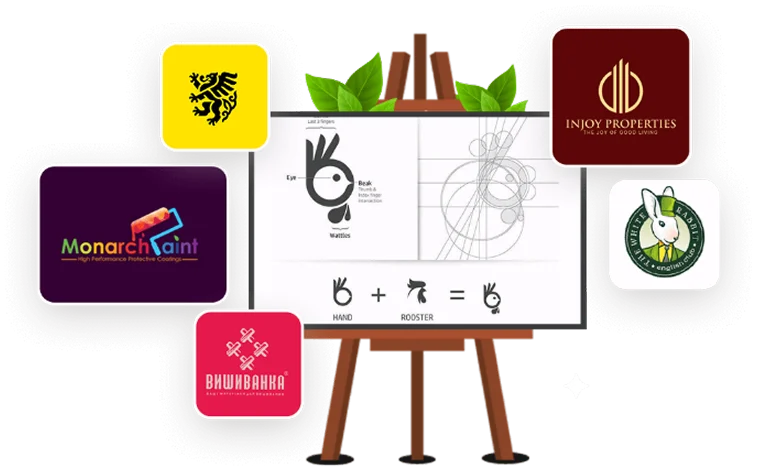
Name-led identities for brands with something worth spelling out.
Kodex Designs believes in transparency every step of the way, keeping you in the loop with every executed plan.
We get to know your brand, your goals, and the audience you intend to reach through conversations and discovery calls.
We draft a tailored action plan with clear deliverables, timelines, KPIs, and the tools and platforms we will use.
Our team sets the plan in motion, and you are updated on progress at every stage of the build.
We make every necessary retouch before launch. Only when you are satisfied do we go live — then we stay on for ongoing improvements.
It suits distinctive or short names, and brands without an obvious symbol. Long or generic names often do better with a lettermark.
As a starting point, yes. We would still customise the letterforms so the result is genuinely yours and protectable.
Yes. Custom-drawn letters are your property. Any licensed typeface used alongside remains subject to its own licence, and we make that clear.
Typically three to five weeks including refinement rounds, since much of the work is slow, precise adjustment.
Tell us the name and the market. We will show you what it could look like drawn properly.


